brand_ nimi
project_ mobile app + web experience design
my role_ feature ideation, UX/UI design, design system development, spec documentation
Business COntext
-
Fragmented Landscape
Business Challenge
In the world of group travel apps, travelers juggle clunky group chats, scattered receipts, and selective social media posts during and after their trip—their digital experience is more chaotic than communal.Design Opportunity
How can we create a seamless, all-in-one digital travel companion? -
Startup Growth
Business Challenge
As a startup, nimi’s immediate business challenge is growth and user adoption. The product design is the core of the brand experience, our main lever to drive emotional connection.Design Opportunity
How can we create an intimate elevated visual experience that keeps users coming back as their trips grow? -
Emotional Payoff
Business Challenge
Traveling with friends creates priceless memories, but the user effort to reward ratio to compile them is often too high. There’s no easily compiled, complete story.Design Opportunity
How can we lower user effort to create the perfect digital souvenir that rewards users for their engagement?
Competitive Analysis:
the Digital Ecosystem for group travel
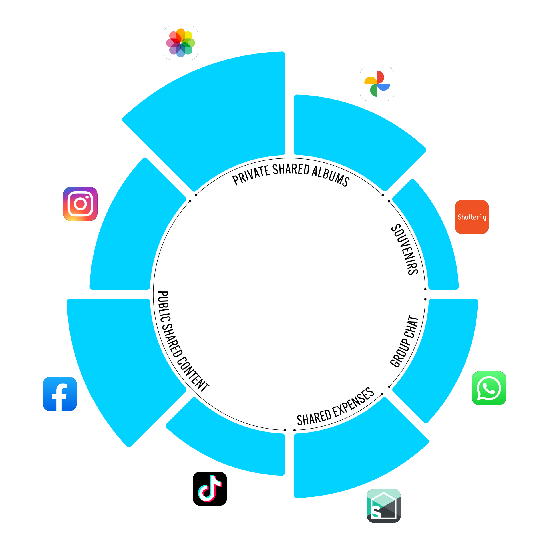
Through secondary research and primary user interviews, I mapped and analyzed the digital ecosystem of the target customer. Sentimentally motivated group travelers ages 25 to 65 use several fragmented systems for sharing photos and content, both interpersonally and broadly.
Insight #1:
Seamless photo sharing is more important than tracking expenses.
Insight #2:
Digital “souvenirs” (Instagram and Facebook photodumps, video compilations in TikToks and Reels, the trip group chat) have superseded custom physical souvenirs (photo books, prints, photo tees).
Strategic Approach
Implementation Plan:
Ideate core features
Establish information hierarchy
Integrate intuitive navigation and novel content design
Development Roadmap:
Alpha launch + testing (android, iOS): product styles, core features, work through tech stack
Beta launch + GTM (android, iOS): build out complete feature set, UX, upgrade content storage
Souveniring (android, iOS, + web): elevate visual style, close the loop on value add
Design Methods:
Competitive benchmarking
User surveys
User interviews
Persona development
Journey mapping
Concept testing
Prototype feedback & testing
Card Sorting
Task Analysis
Accessibility evaluation
Usability testing
Contextual inquiry
Think-aloud protocol
Event tracking
Analytics review
Developing the Core User Persona
I helped the product team focus in on a key directive: build for the digital familiars. Gen X and Millennial users are quintessential nimi trip creators because they are old enough to see every trip they go on as sentimental (kids, family, school reunions, etc) and young enough to want to share the highlights on social channels (where their public life exists).

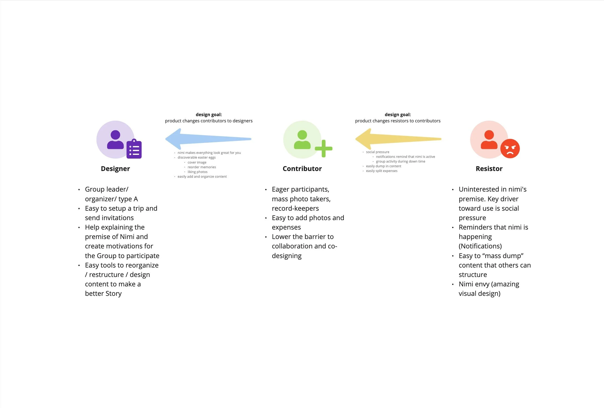
Analysis of User Types
To clarify the variety of pain points for users in a travel group, I helped establish this framework of Trip Designers, Contributors, and Resistors. Understanding the drivers and blockers for each user type (most group trips include all of them) unlocked specific design solutions to support activities for all users and improve overall adoption.
Visual Evolution
Take a closer look at 3 features I proposed, designed, and delivered that had a significant impact on user adoption and retention.
TRIP HOME SCREEN
Alpha user testing and interviews revealed a disconnect in users’ mental model of the product features as well as a general confusion across similar looking screens in the app. I proposed, ideated, and delivered a new “home” screen within the trip to solve this problem.
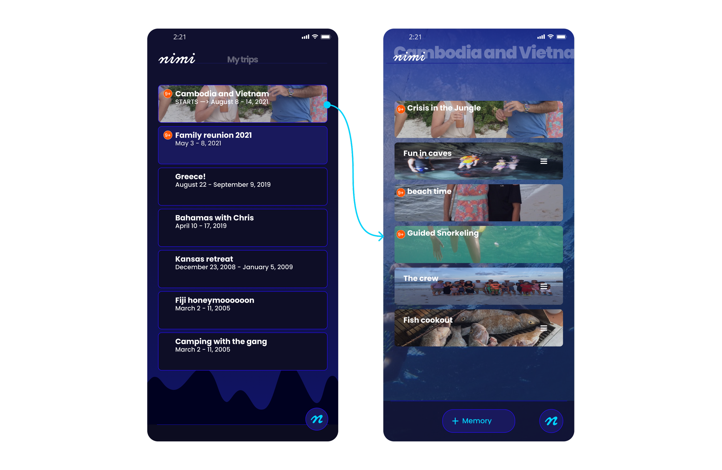
Before
The existing landing page when users went into a trip was a list of the trip’s memories. Because of identical design patterns used to visualize 2 different items, users often confused these two screens and became lost in the core feature of the product.
After
A trip “home” page supports the accurate mental model for all the components of a trip: memories, people, expenses, and the general photo pool . The visual hierarchy emphasizes the core premise of nimi: the group curation and storytelling with multimedia content. The new memory card design aligns with the trend towards vertical media and functions as skeuomorph of book pages, drawing the connection between memories and chapters in a story. Contextual “create” buttons lower the barrier for hesitant group members to effortlessly add content to the trip without having to navigate deeper into the product.
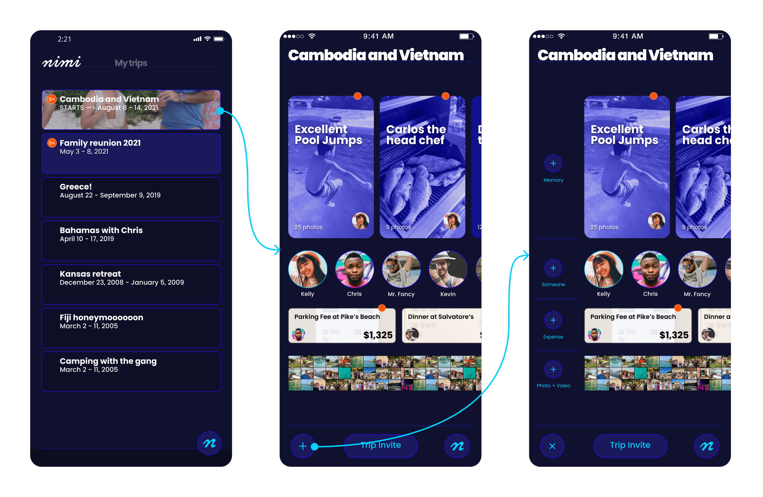
Invite Experience
Alpha User testing revealed a significant barrier for trip creators and drop off from invited members with the current invite flow. I ideated and delivered a new flow to address these pain points.
Before
The existing landing page when users went into a trip was a list of the trip’s memories. Because of identical design patterns used to visualize 2 different items, users often confused these two screens and became lost in the core feature of the product.
After
A trip “home” page supported the accurate mental model for all the components of a trip: memories, people, expenses, and the general photo pool . The visual hierarchy emphasizes the core premise of nimi: the group curation and storytelling with multimedia content. The new memory card design aligns with the trend towards vertical media and the idea of book pages, drawing the connection between memories and chapters in a story. Contextual “create” buttons lowered the barrier for hesistant group members to effortlessly add content to the trip without having to navigate deeper into the product.
process_app architecture


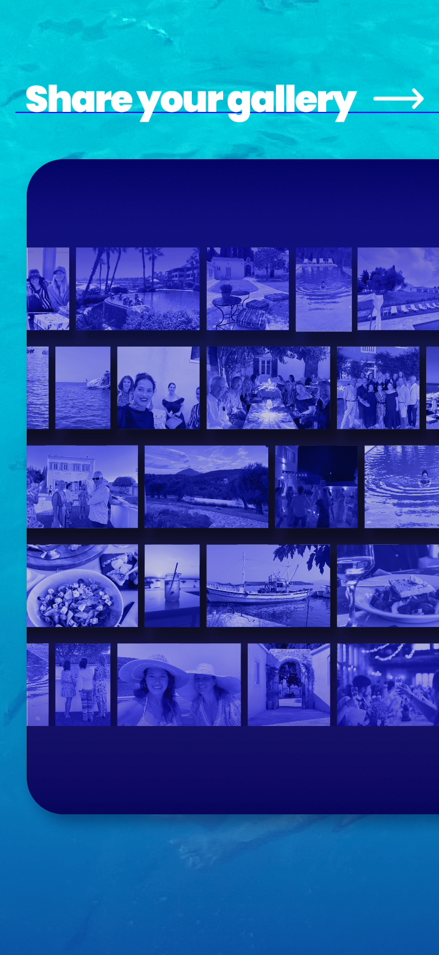
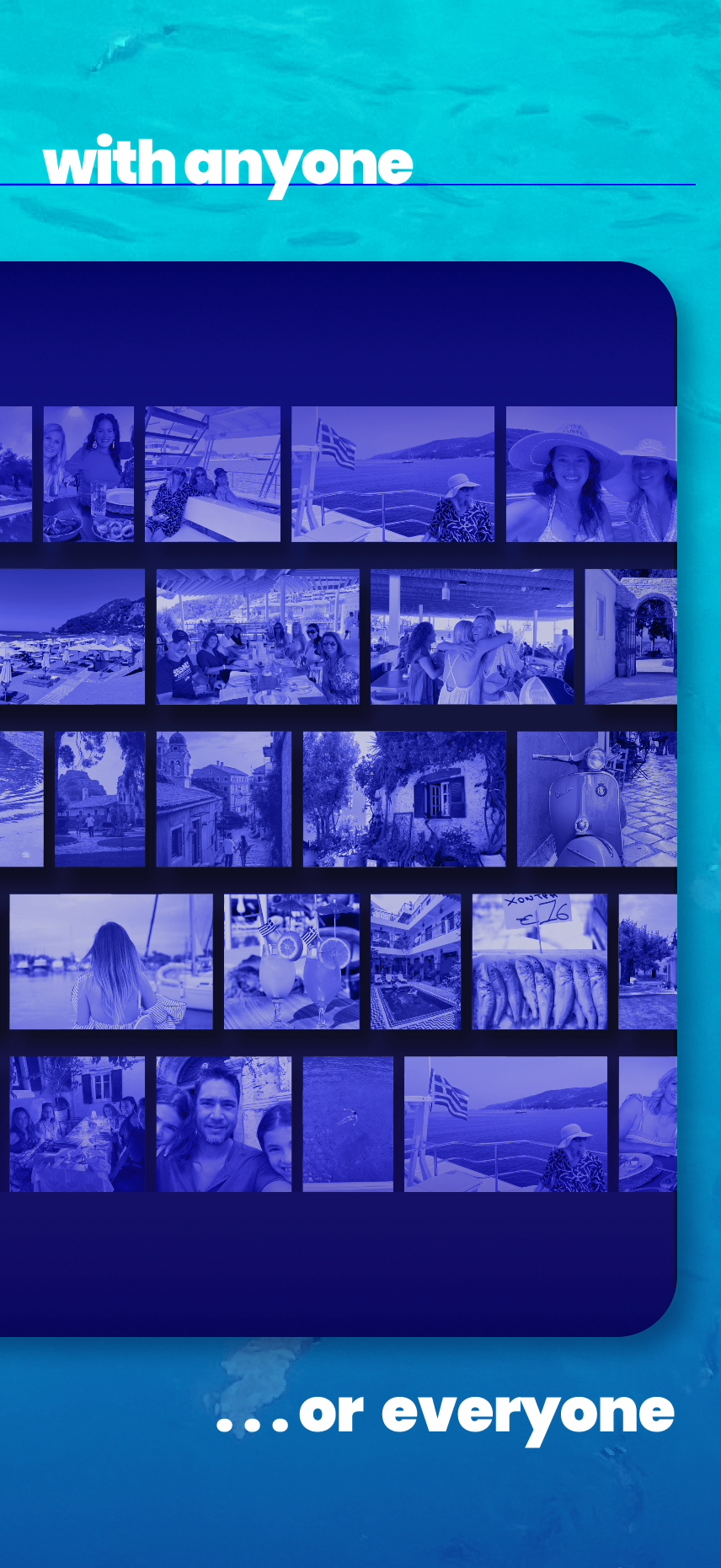


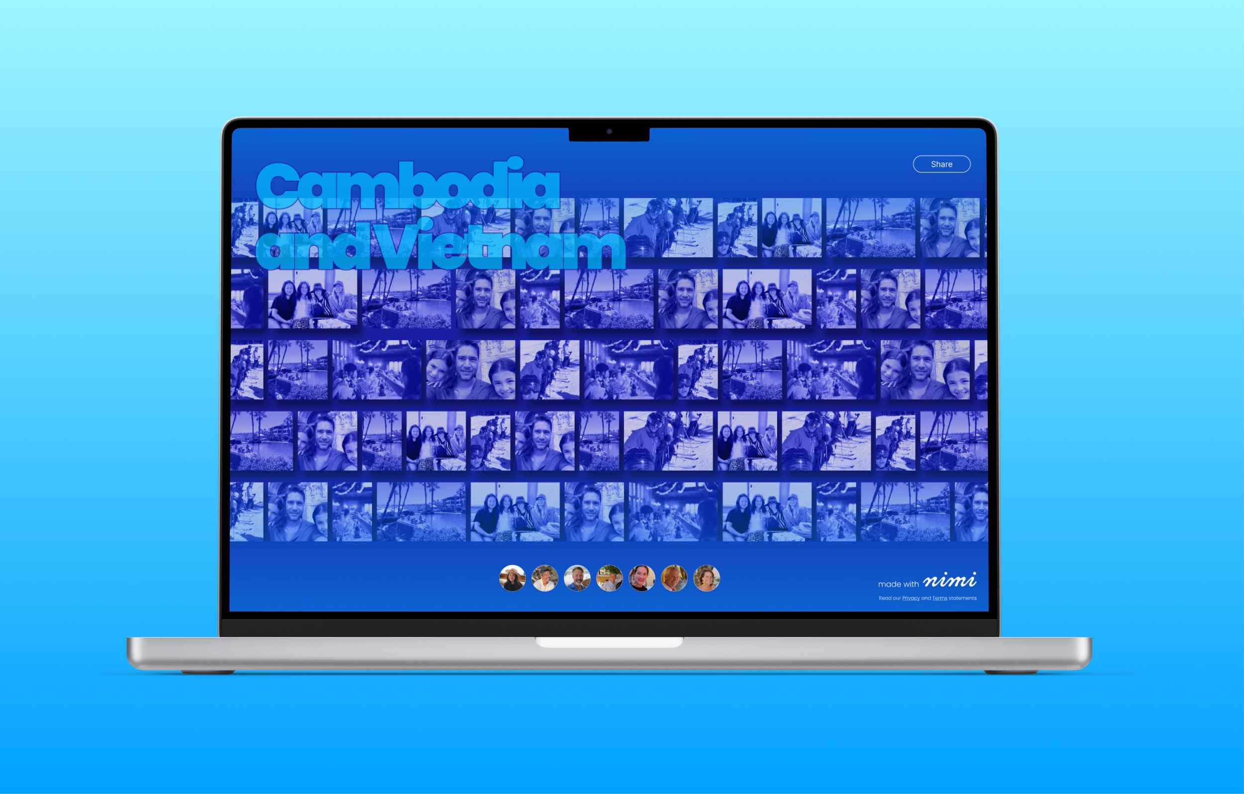
feature_shareable web gallery
Measurable Outcomes
-
Organic Growth
With almost no marketing budget, nimi grew from less than 500 user at beta launch to over 22,000 unique users on iOS and Android devices. One third of trip participants started new trips, proving out the Contributor > Creator pipeline.
-
Brand Partnerships
Brands like NASCAR and Princess Cruises have been engaged in discussions to white label nimi for their own digital fan experiences. nimi’s sticky experience prompted users to purchase wifi on cruises and inspired them to suggest ship-wide nimi trips to our product team. -
Satisfied Clients
“Caroline added a dimension of logical and purposeful design work to our product team. She was instrumental in transforming this product from a collection of ideas and features into a market ready consumer lifestyle app.”
- nimi product leader

credits_ completed at Paper Crane Factory in collaboration with nimi product team, Fexle (app dev), & Ryan James (web dev)