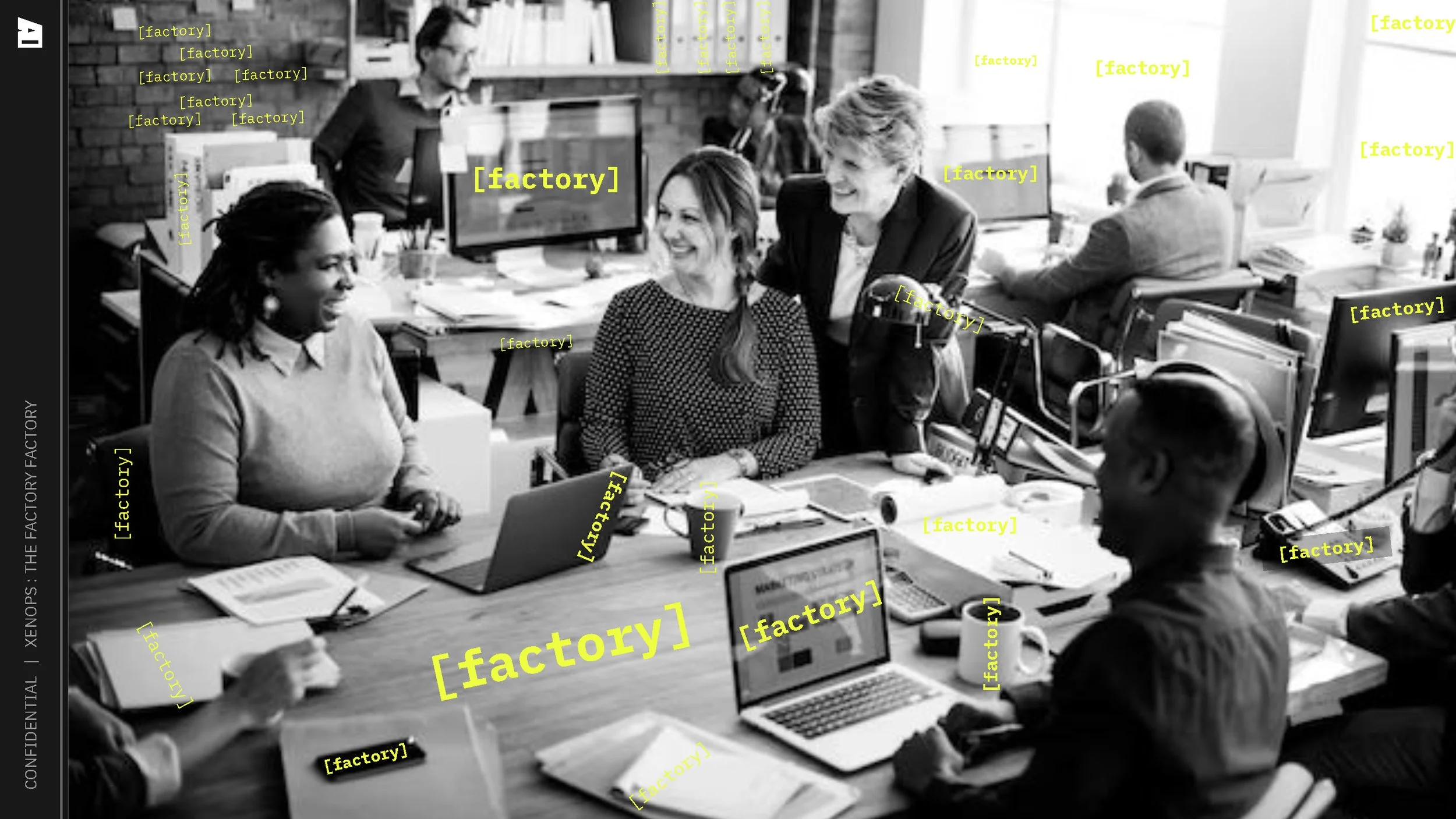
brand_ Xenops
project_ desktop web app design foundation
my role_ owned all UX, menu UI, and component documentation, collaborated on UI for canvas and items
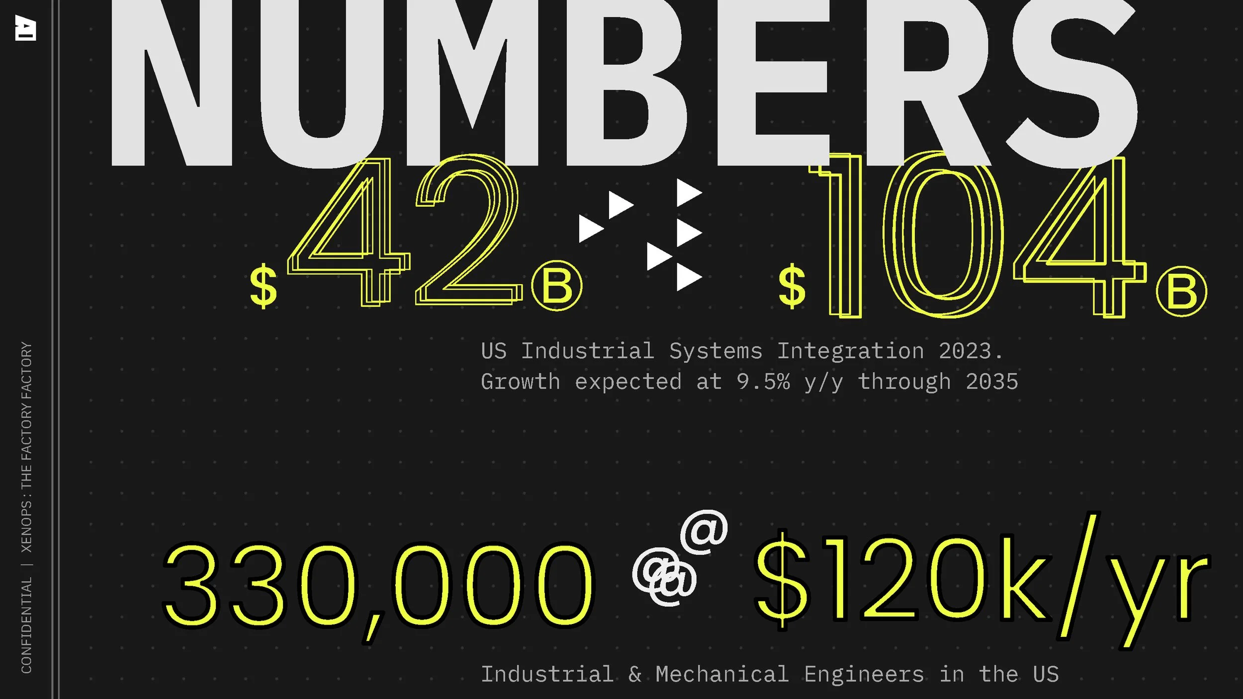
Business COntext
-
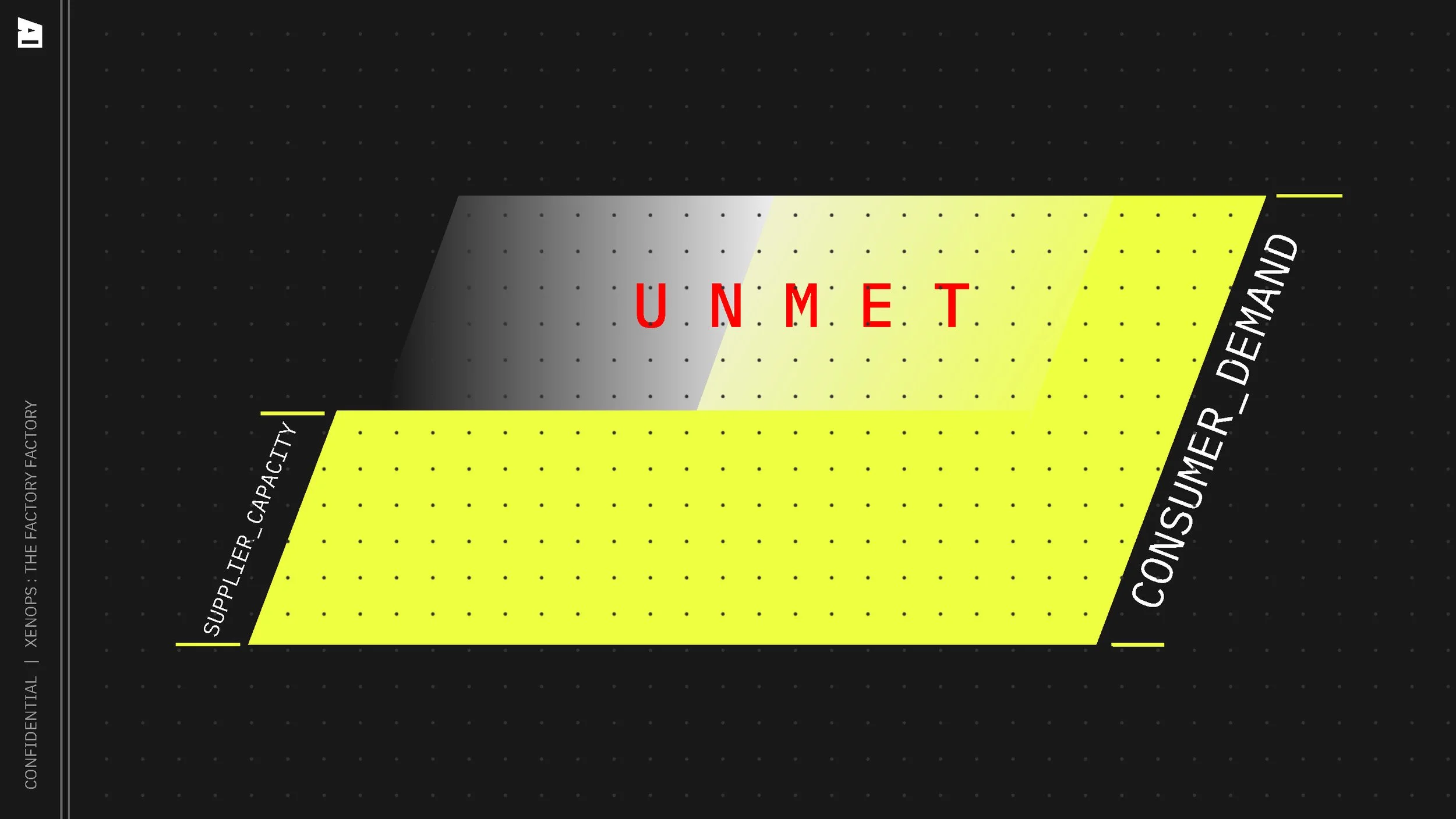
Product-Market Fit
Business Challenge
With the foundational architecture for their product built, Xenops needed to create a usable interface to begin testing with early users. The front-facing proof of concept was a vibe-coded prototype built with little UX consideration.Design Opportunity
How can we facilitate a seamless user experience for early product testing? -
Legitimacy
Business Challenge
As a startup seeking pre-seed investment on the basis of a vibe-coded proof of concept, Xenops’ flagship product was unprepared for investor scrutiny. The product lacked a coherent information system and had no visual connection to the brand.Design Opportunity
How can we communicate legitimacy, expertise, and brand ethos in a new product with a single feature? -
Scalability
Business Challenge
Xenops sought to define a UX strategy and visual system to scale with and guide the product at a time when only the first of several features had been clearly defined.Design Opportunity
How can we create a design system that can scale into unknown use cases?
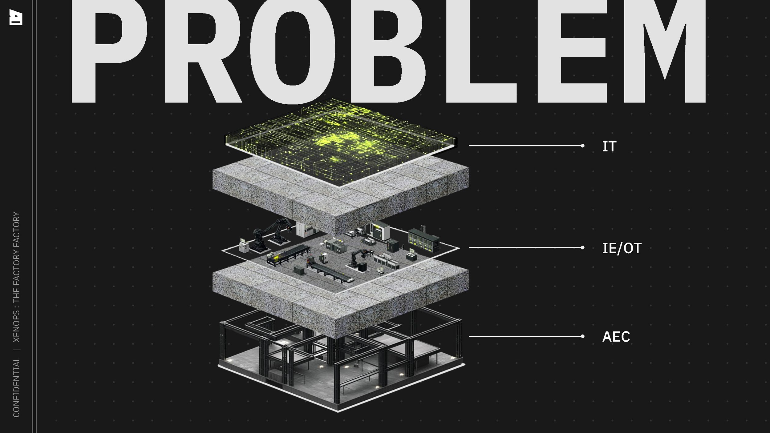
Uncharted Territory
The manufacturing space is slow to innovate, and Xenops is poised to disrupt it with open source, AI-enabled software.
Strategic Approach
Implementation Plan:
Establish the overarching product design strategy
Overhaul the UX of the existing feature prototype
Create consistent UI patterns and styles to be applied and scaled to future features
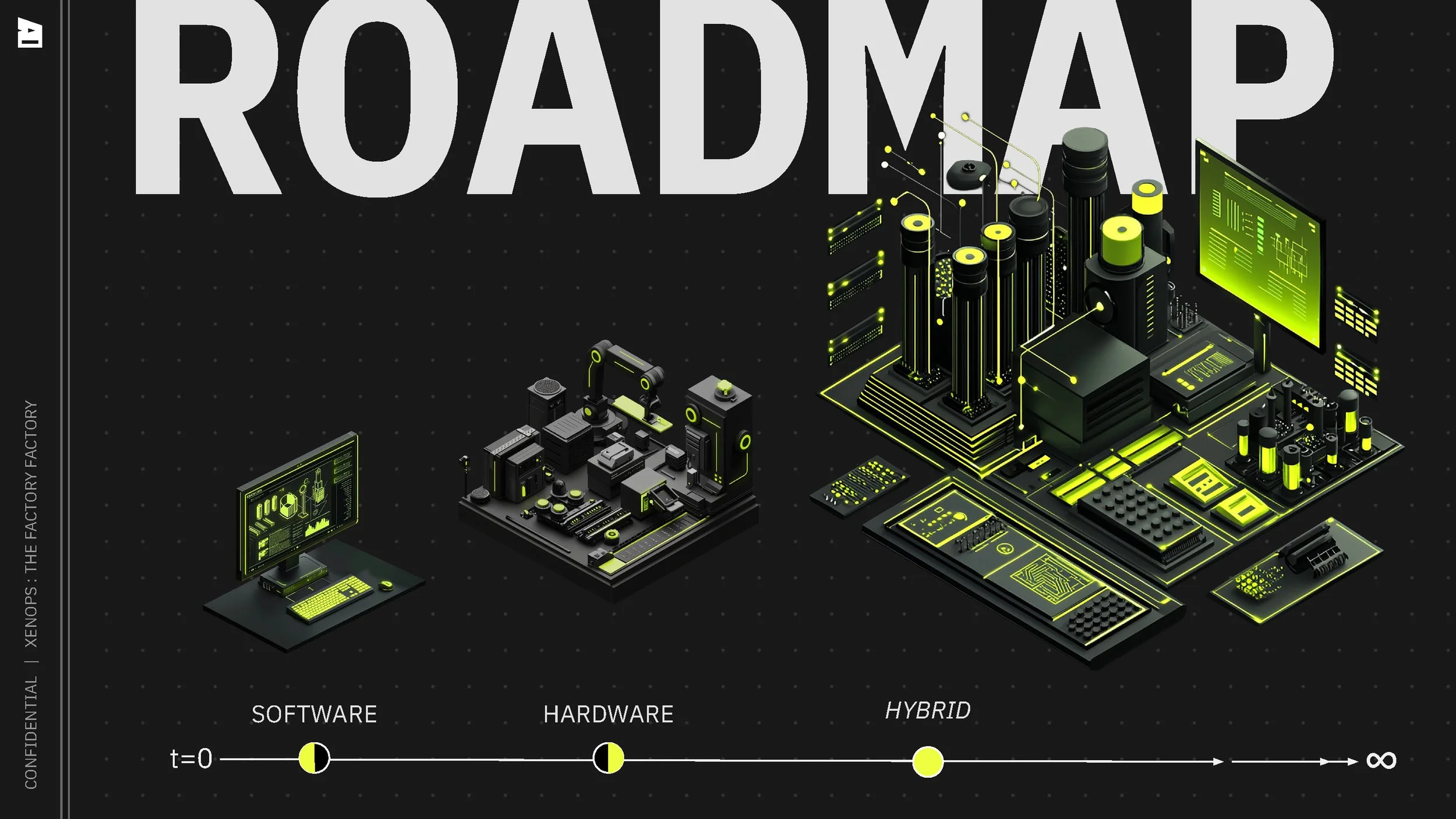
Development Roadmap:
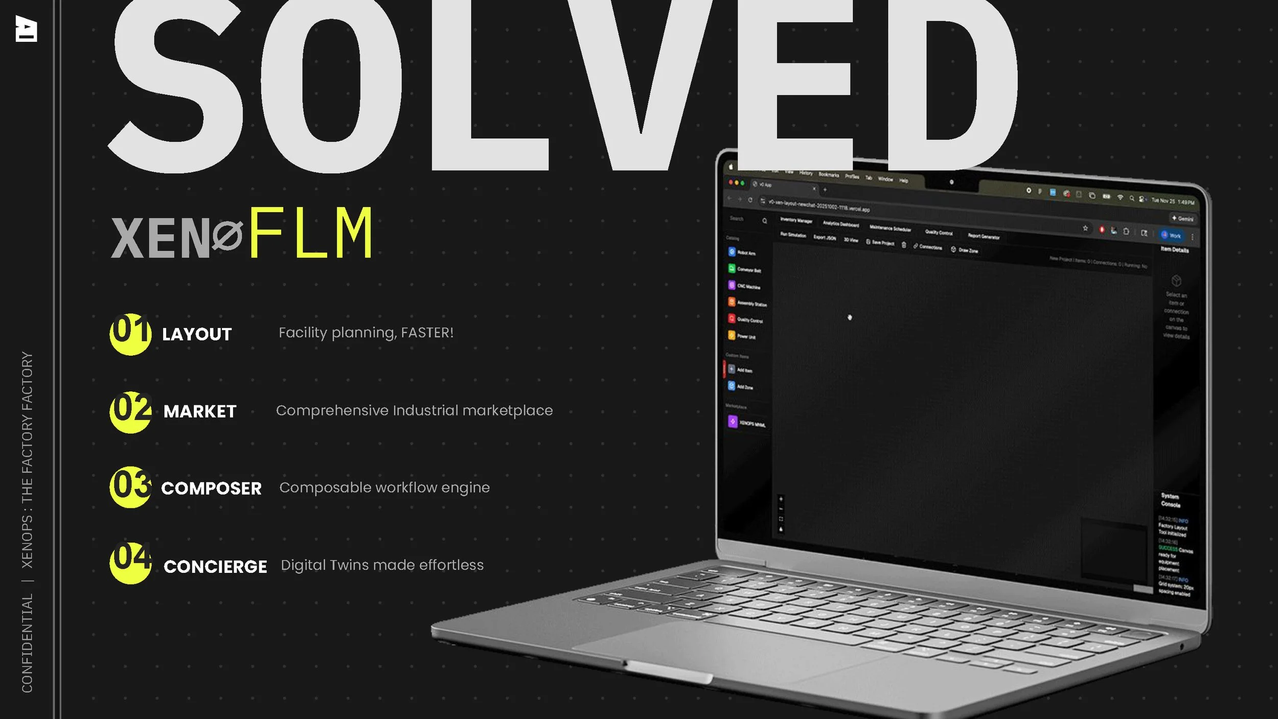
Existing proof of concept (v0 prototype): Xeno LMT factory layout tool
MVP product (React web app): Full UX/UI overhaul of existing feature, style guide and component library for upcoming feature expansion
Future: full product suite including comprehensive industrial marketplace, composable workflow engine, and factory digital twins concierge
Design Methods:
Competitive benchmarking
Wireframing
Prototype feedback & testing
Task Analysis
Accessibility evaluation
Usability testing
Design Direction
To align the founding team and future product builders, I defined the Xenops core UX/UI strategy as an extension of the brand. With little concrete functionality defined, I focused on the company’s positioning and customer profile, UX best practices, and the creative direction established in early branding efforts.
Flagship feature Redesign
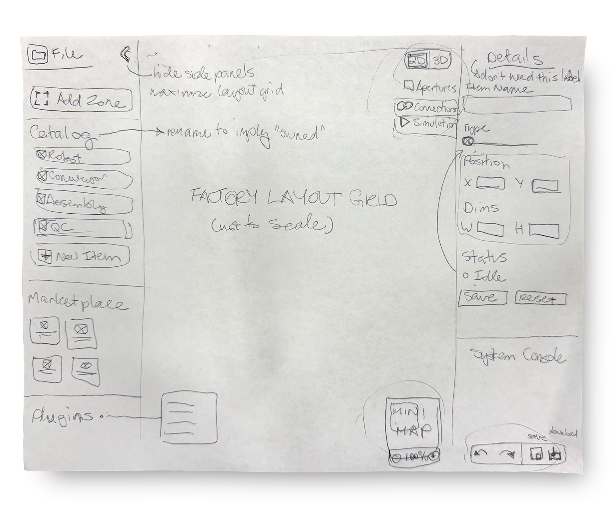
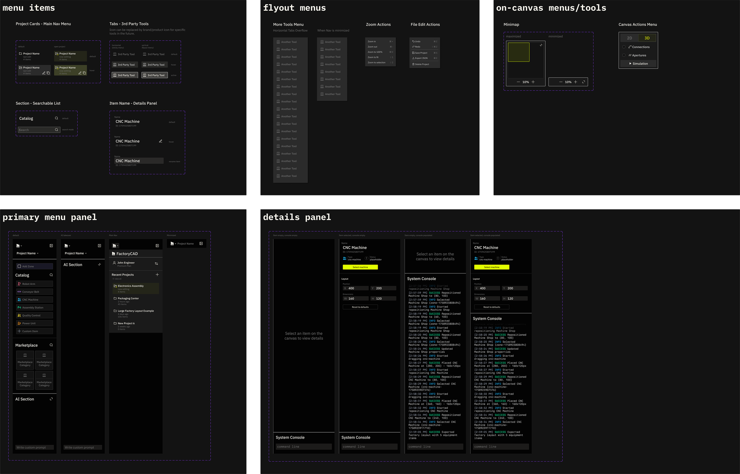
I lead a UX ideation session to audit the existing factory layout tool and rearrange the menu elements into a more coherent, scalable system. I explored a compact 2 panel layout to give the factory canvas as much central space as possible, overlaying contextually relevant tools on top of it. I ideated a panel minimizing function to further expand canvas workspace. I grouped related elements— like the canvas visual mode controls— together and created visual separation between the unique groups— like the catalog and marketplace.
User Feedback
Testing this paper prototype with early product users resulted in 2 key changes:
File level actions (undo, redo, save, download) were difficult to locate in their current position at the bottom of the righthand panel. Users expected to access them via a standard File menu in the top left section of the screen.
Plugins were buried at the bottom of the lefthand panel, improperly grouped with objects to be placed on the canvas. As conceptually higher level items related to the central layout activities, users expected to access these in a central menu above or below the canvas.
Visual Evolution
Take a closer look at the factory layout tool evolution from start to finish.
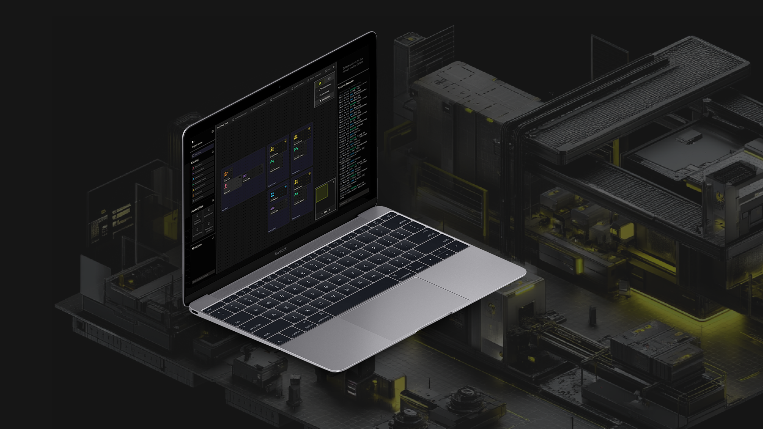
Full Product layout
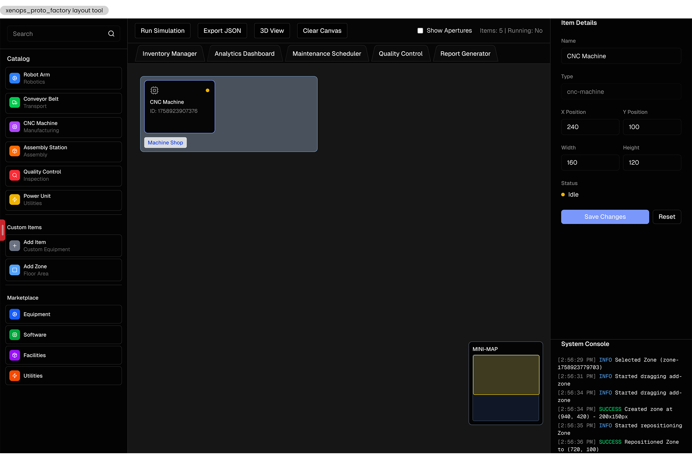
Before
The initial proof of concept for the factory layout tool was a vibe-coded prototype built with little UX consideration. It lacked a coherent information system and had no visual connection to the brand. Core features had little to no affordance, and the experience was disjointed and painful.
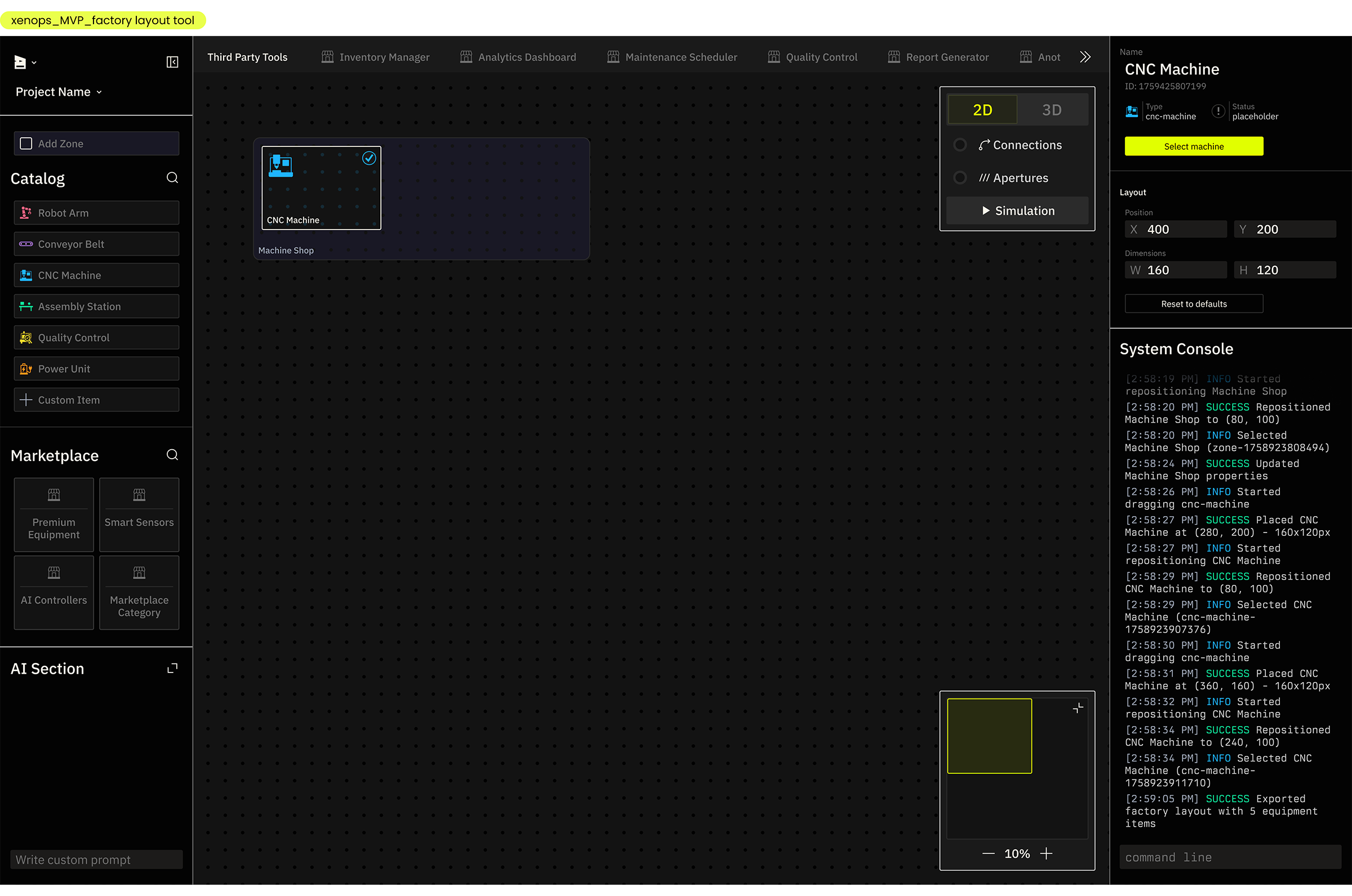
After
The redesigned factory layout tool uses an intuitive inverted U menu, effectively grouping related elements. File and project level controls, primary layout elements (for dragging and dropping onto the canvas), and an AI tool (future addition) occupy the left panel. Third party tools and plugins are available in a minimized list above the canvas, following the interaction paradigm of browser bookmarks. The right panel contains contextual details, such as selected item properties and the system console, an interactive record of actions in the product. Controls relevant to the canvas, the mini map and canvas actions, are overlaid directly on the canvas as small floating panels. Everything is resizable and collapsible, giving the user control over the visual noise during deep work sessions on the canvas. The visual presentation is coherent and scalable to future features. It uses custom type, colors, and icons to establish the product as a core surface of the Xenops brand.
Primary Menu Panel
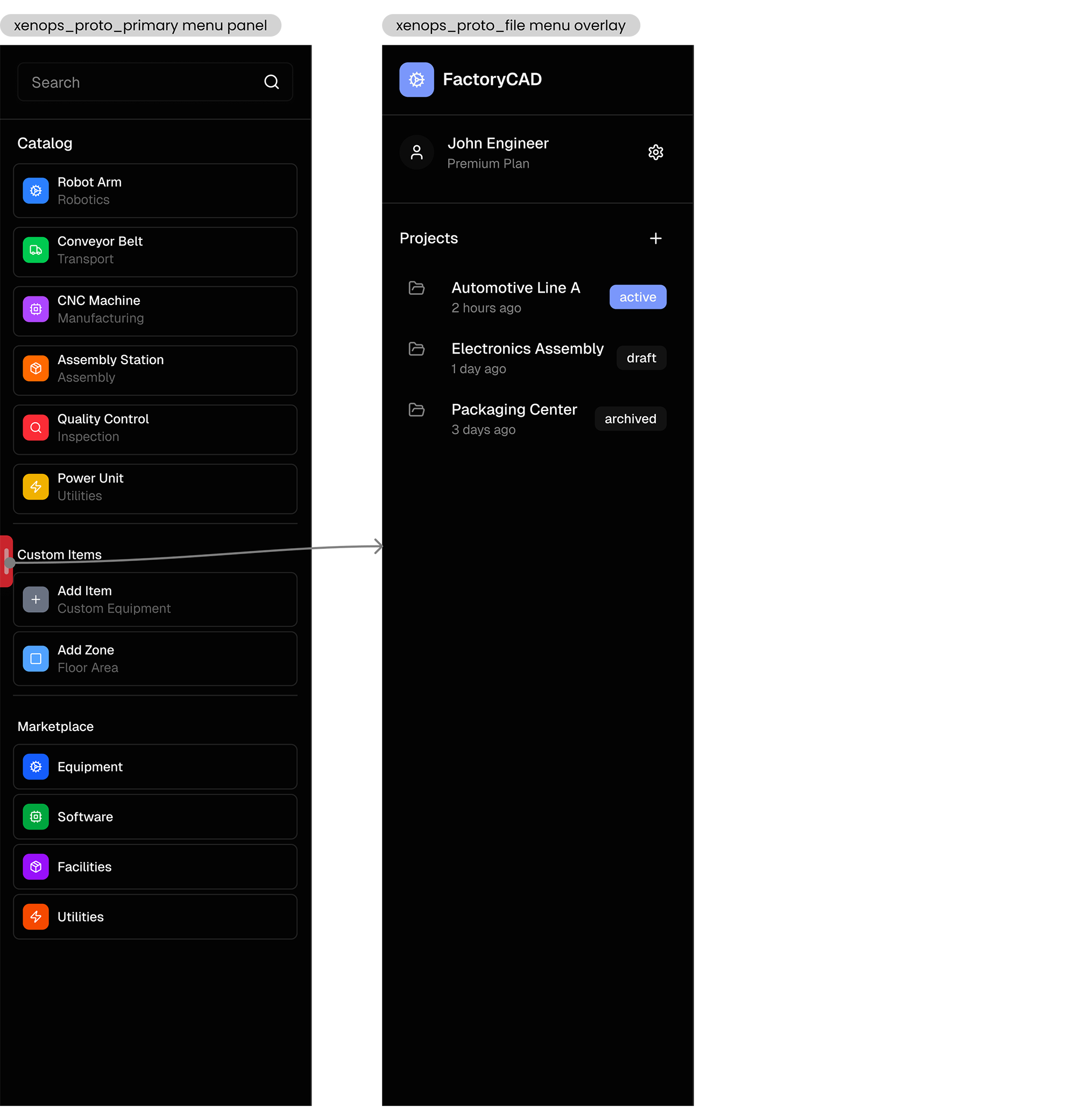
Before
The listed catalog, custom, and marketplace items in the lefthand panel were styled identically, leading to confusion over their different meanings in the product. The search bar was unclearly associated, and the project-level menu was accessed through a small and ineffective pull tab on the side of the panel.
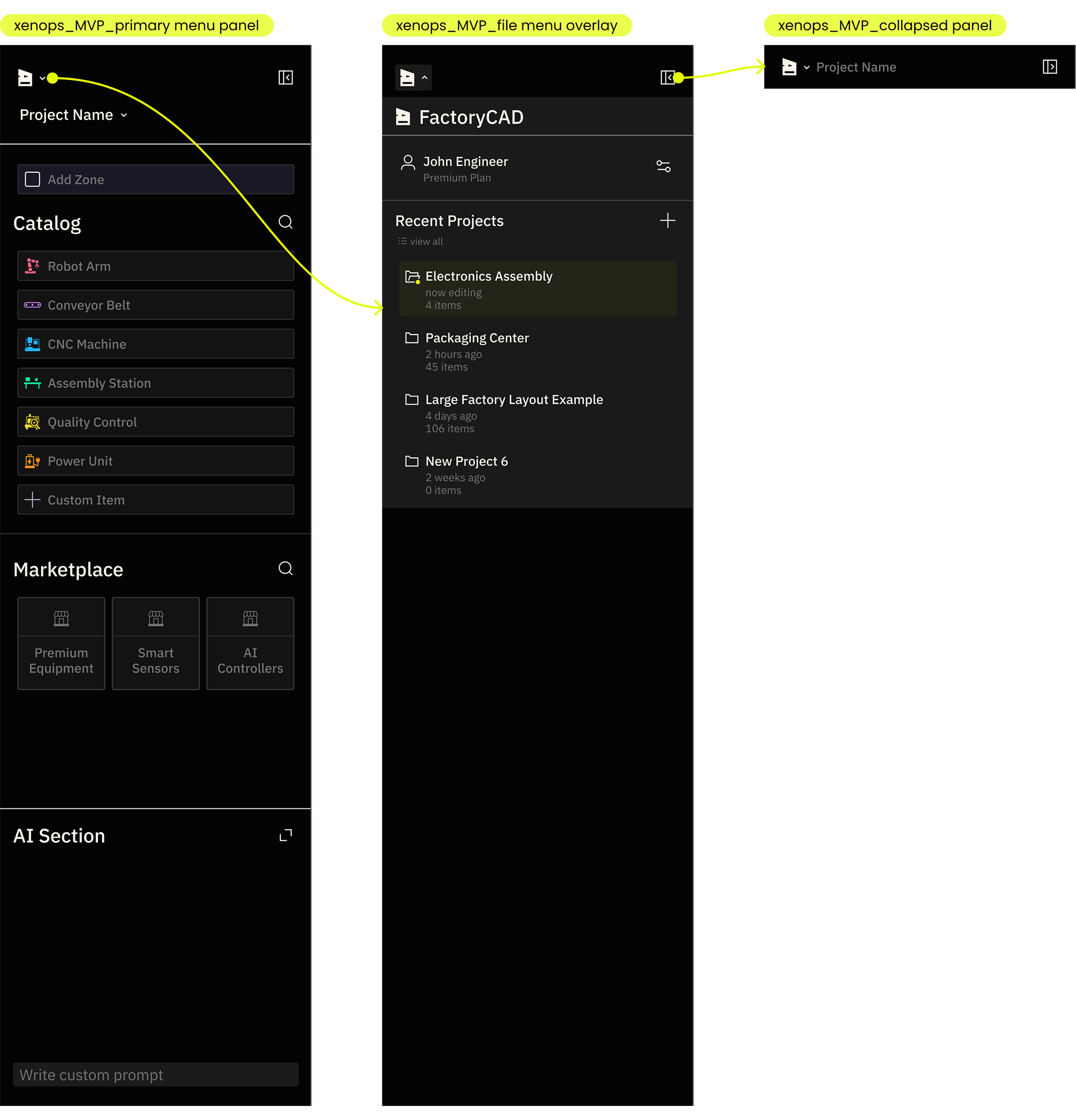
After
The list items are grouped more clearly and styled for faster differentiation. Both the item catalog and marketplace are independently searchable with contextually adaptive headers. Zones are separated from the other drag and drop items, indicating their unique layout organizing function. The project level menu is accessed via the Xenops icon button in an expected location, and with the appropriate affordance of an arrow icon and hover state that communicates interactivity.
Plugins and Actions
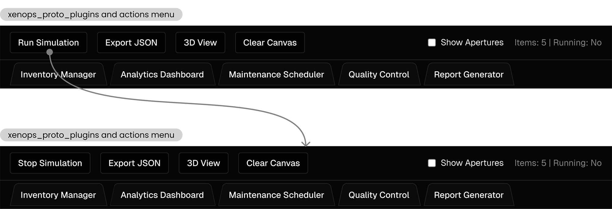
Before
Several types of buttons were unintuitively shoehorned into the top menu. File level actions like export and clear were intermixed with canvas actions like 3D view and simulation. 3rd party plugins were similarly styled and laid out, causing user confusion and cognitive overload. The buttons used the same styling in both default and active states, resulting in too little visual feedback from user actions.
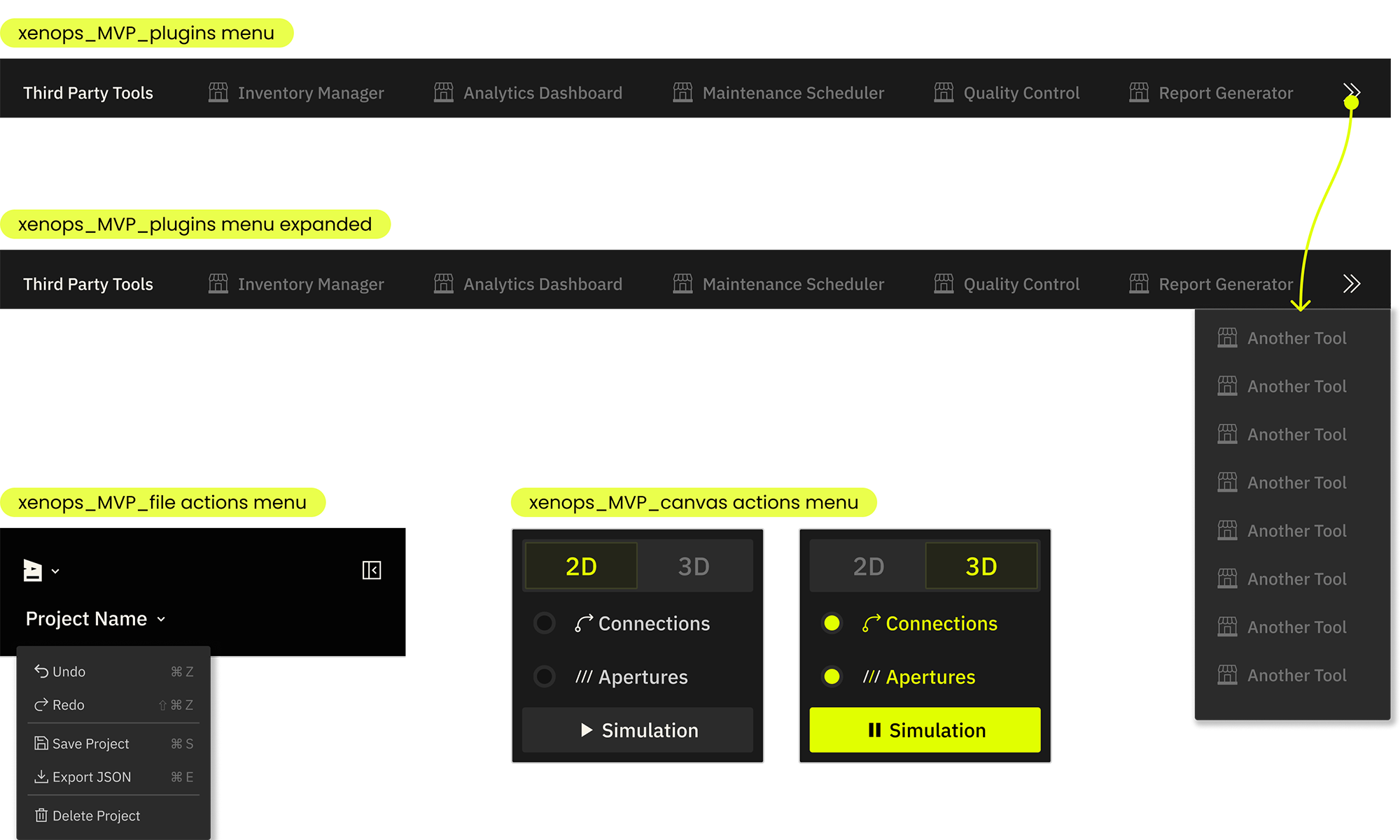
After
File level actions, canvas actions, and 3rd party plugins are grouped according to function and context. Third party tools use the familiar styling and interaction paradigm of browser bookmarks, featuring logos for quick brand recognition and an expandable panel for extended lists. File actions also follow a standard interaction paradigm, accessed via a File menu in the top left corner and via their universal hotkeys. Canvas actions are grouped together and displayed contextually on top of the canvas. They use appropriate button and toggle styles based on their logic, and are styled for clear interaction feedback with strong visual differentiation for active states.
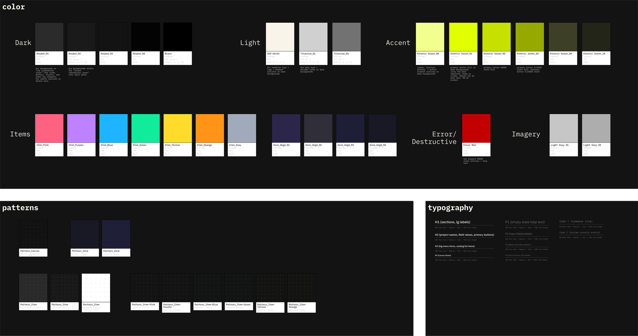
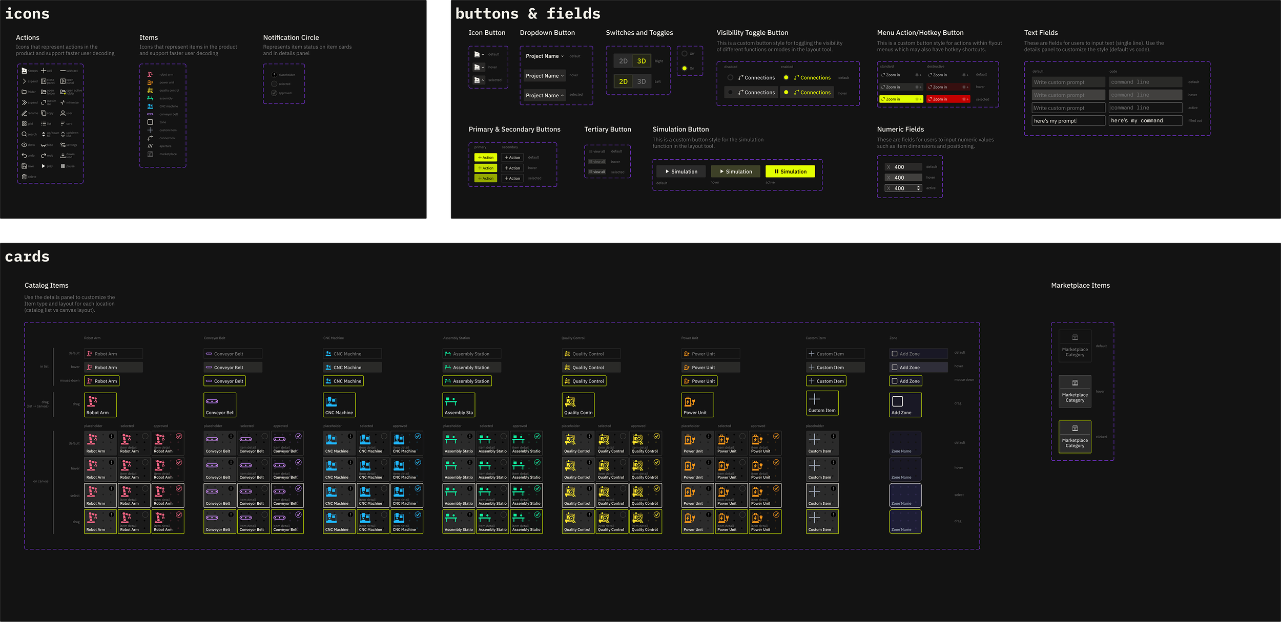
Design System
I built and delivered a mini product style guide and fully specified, WCAG AA compliant component library for the development team to redesign the factory layout tool and as a starting point for future features.
Impact + Results
-
early customer onboarding
After implementing the feature redesign, the Xenops team was able to onboard early customers and facilitate product-specific feedback without being slowed down by usability issues. -
funding milestone
The redesigned product demo became a centerpiece of investor conversations. It communicated manufacturing expertise and product innovation without usability friction distracting from the core value proposition. Xenops closed a $2.25M pre-seed round shortly after launch. -
New features
Since the redesign, Xenops has begun implementing additional features using the UX/UI strategy and style guide, ensuring the product is cohesive and on-brand as it evolves.
credits_ completed at Paper Crane Factory in collaboration with Xenops founding team