brand_ Jungo
project_ mobile app redesign
my role_ owned feature ideation, UX/UI design, and design system + documentation
Business COntext
-
Poor User Retention
Business Challenge
Jungo had a high cost of user acquisition and a low retention rate after first open. The team spent months hand-holding top college recruiters through onboarding, and failed to captivate the players — digital natives with high expectations — they needed to attract to grow. The app promised a lot but was stunted by a disjointed experience and an ineffective UI.Design Opportunity
How can we transform a complex recruitment ecosystem into a seamless, intuitive platform that works for core users? -
Limited Market
Business Challenge
Although serving one of the most popular youth sports in the American market, Jungo couldn't scale because of its hyper-specialized purpose: helping high-level soccer players get recruited to play in college and beyond. A concept that could strengthen the pipeline for millions of players was only speaking to a fraction of them.Design Opportunity
How can we support player development for all ages and abilities? -
Disconnected Pathways
Business Challenge
The recruiting process is non-linear and unique to every player — a high-stakes coordination between athletes, parents, coaches, and recruiters with no shared system. Players have little agency to get in front of a broad audience, and roster spots go unfilled because of all the barriers standing between talent and opportunity.Design Opportunity
How can we build a platform that empowers players and recruiters in the recruitment process while maintaining player privacy and recruiter discretion?
Journey map:
The player pathway
Through secondary research and primary user interviews, I mapped the player’s journey from rec soccer to college recruitment, focusing on the digital tools used by 3 key stakeholders: the player, the coach, and the parent.
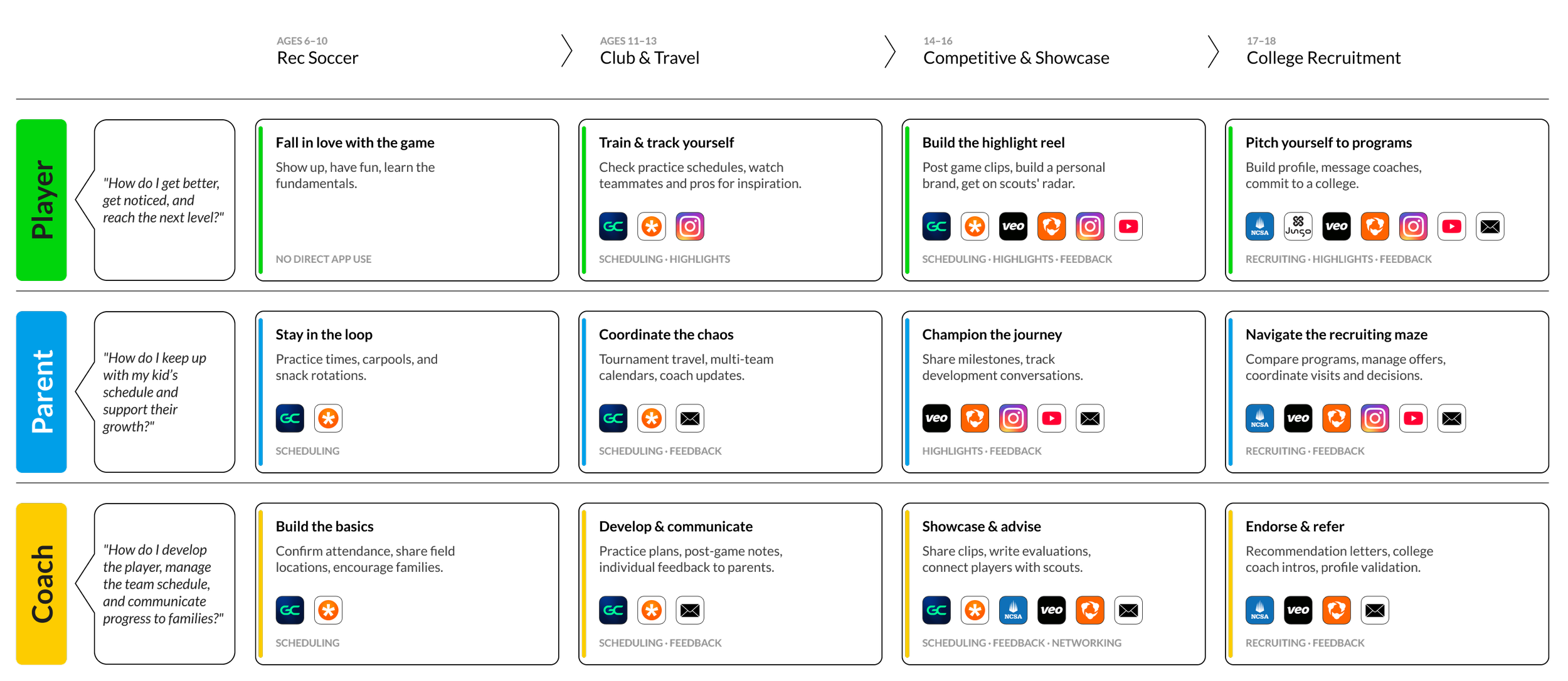
Insight #1:
Consistent, structured, individualized feedback from coaches is the top driver of player retention — but the digital tools to deliver it don't exist at the rec level. Jungo’s opportunity is to pioneer this experience.
Insight #2:
Parents are crucial stakeholders at every stage of the process, but their responsibilities shift as their player progresses. Jungo 2.0 must address this tension of ownership, empowering both players and their parents at every stage.
Strategic Approach
Implementation Plan:
Overhaul the UX of the existing product
Develop a clear framework of user types and role-based permissions
Ideate and test new features for a broader market
Create consistent UI patterns and styles applied universally across the platform
Development Roadmap:
Existing MVP (android, iOS): College-bound competitive player focus; basic profile, rating, recruitment
Jungo 2.0 (android, iOS): Full UX/UI overhaul; addition of rec player, parent, and youth coach user types, new feature set geared toward youth soccer; complete style guide, component library, and user flow diagrams
Future / Scale: League-level tools, social/broadcasting dimension, cross-sport expansion
Design Methods:
Competitive benchmarking
User interviews
UX audit
Task analysis
Persona development
Wireframing
Prototype feedback & testing
Accessibility evaluation
Stakeholder Needs
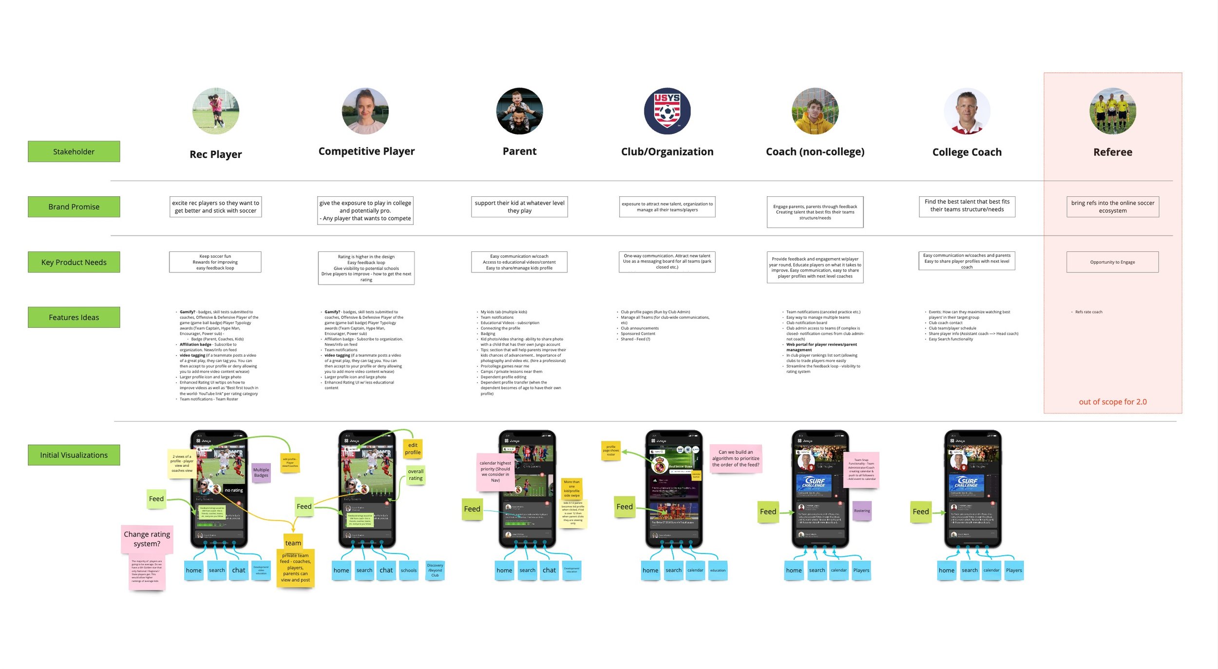
Jungo's platform expansion aims to serve five distinct user types, as well as the soccer clubs and organizations with the power to drive club-wide adoption. I established the core brand promise and product needs for each persona, then ideated feature concepts and initial screen visualizations to set the vision for Jungo 2.0.
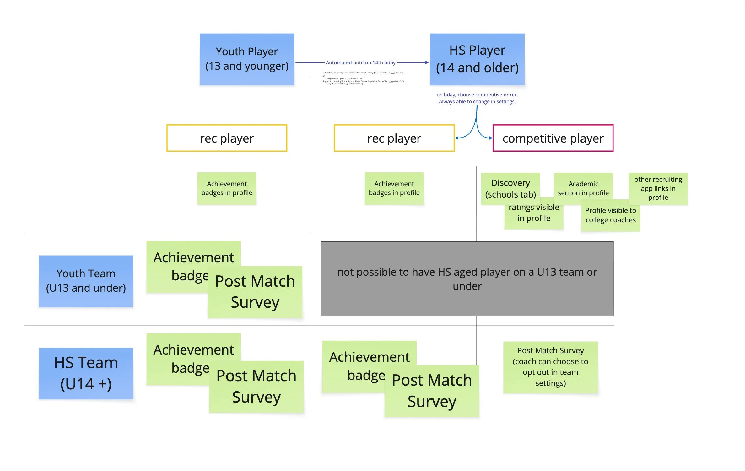
permission based roles
I mapped the system of user roles, permissions, and feature access to establish a clear structural foundation before any visual design began. This framework became the reference point for every navigation and feature decision throughout the project.

This activity surfaced a few complexities: rec and competitive players fit structurally into the same role for their Teams, Parents, and Coaches, but have entirely different roles in the recruiting space. Parent visibility and control of their player’s profile is not simply split by rec and competitive players, as there isn’t a mandatory age for either type of player. Through user research, parents indicated their intent to set up and manage kids’ profiles early on, then shifting that responsibility to their child later based on several factors, including phone ownership and maturity. Therefore, the parent user type was given “view only” permission of their kids’ profiles, and multi-profile login was prioritized in development. On teams with both rec and competitive players, coaches must have the ability to tailor their team feature set to the needs of the group.
Youth Sports Psychology Research
To ground new features in real user behavior, I researched the psychology of youth athlete motivation and retention— particularly around intrinsic vs. extrinsic motivation, and why players disengage when they can’t see their improvement. Key insights shaped the direction of the Development feature and the badge system.

Visual Evolution
Take a closer look at 2 redesigned features and 2 new ones with the most impact on usability, stakeholder adoption, and product reach.
Redesign: Profile Pages
The disjointed experience across the app was a key reason for poor user retention. Players specifically were not emotionally connected to their own profiles, the core feature in the product. The player profile experience was also a key promise for both new user types, rec players and parents, and it was failing.
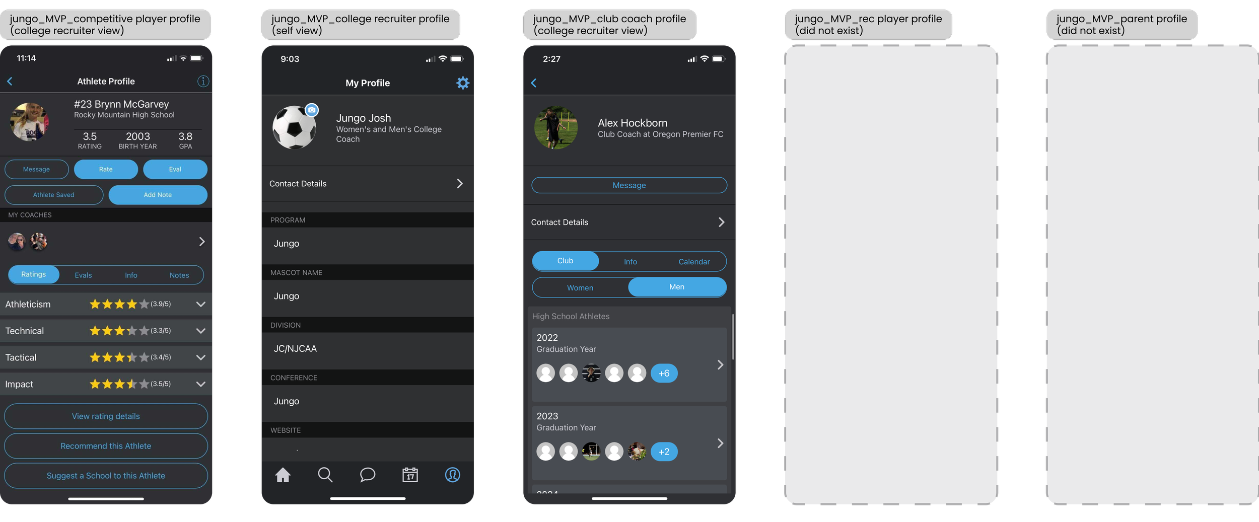
Before
The competitive player, college recruiter, and club coach profiles had inconsistent information hierarchy and ineffective UI. The app was losing traction here because the visual treatment of the profiles was too tactical, a flat hierarchy similar to complex settings rather than modern, front end UI.
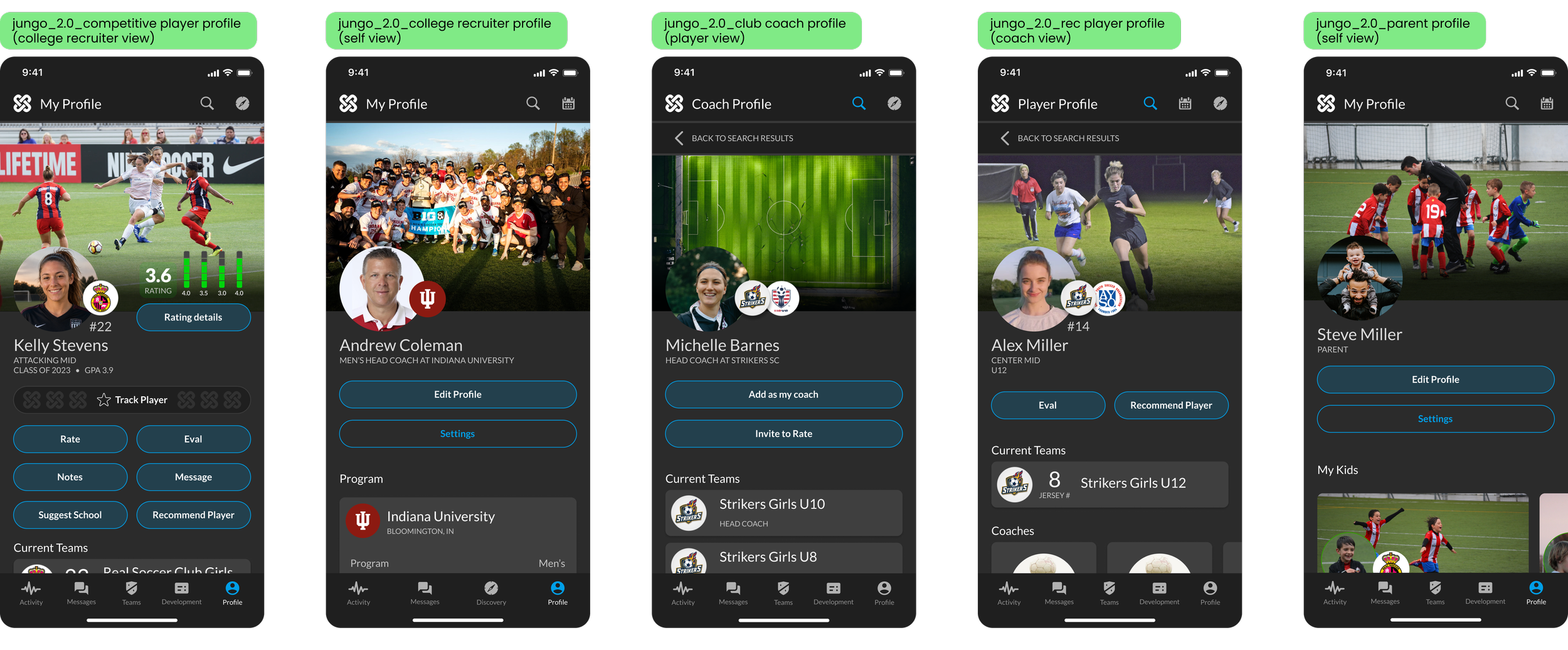
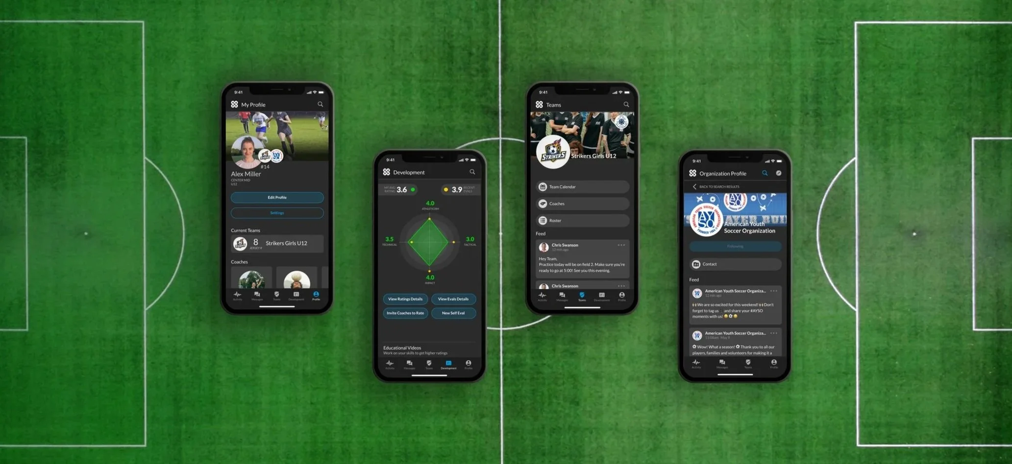
After
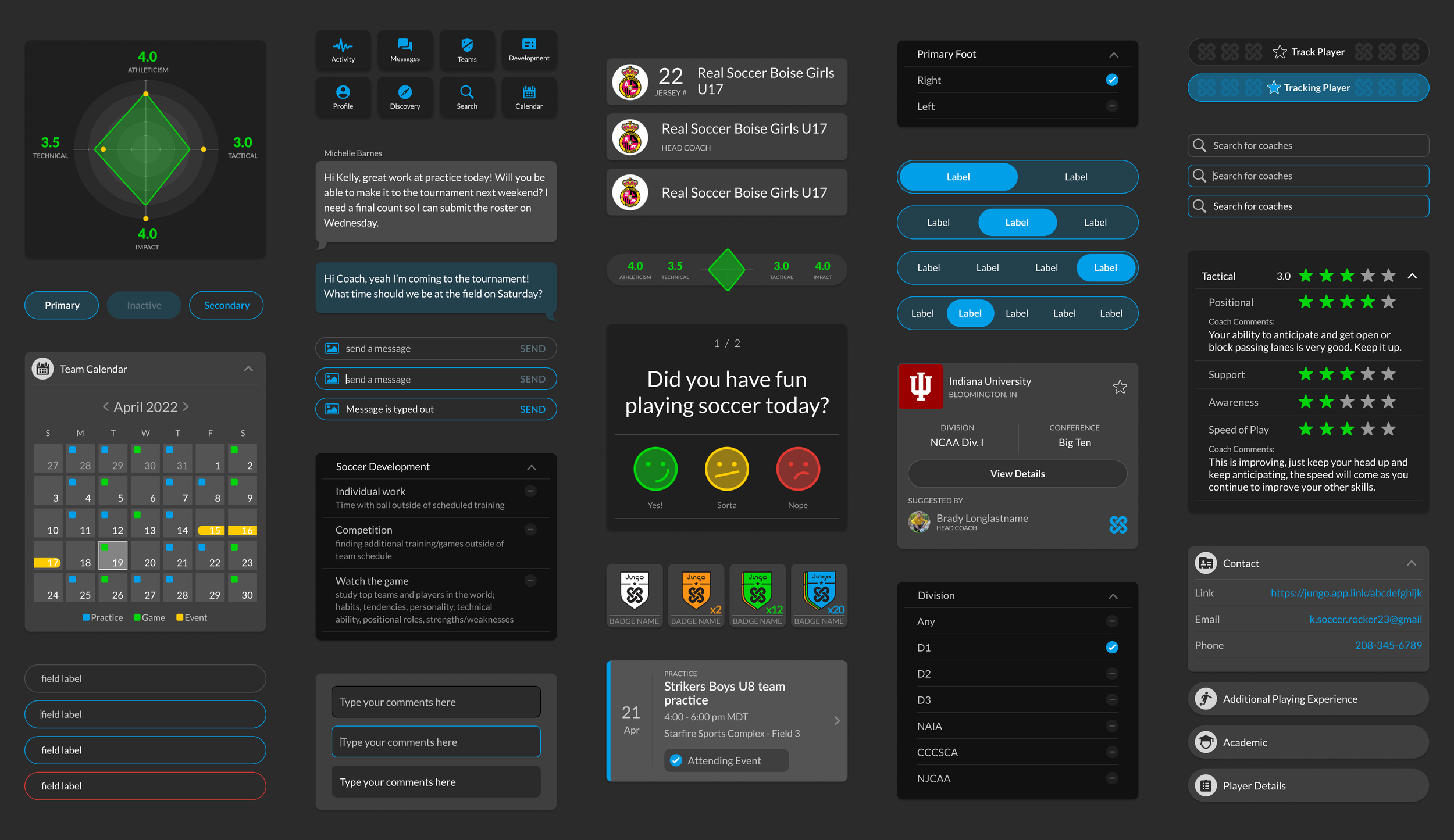
I established a new and consistent design system for the profile page, which flexes as information and permissions change per user and across different views. A visually captivating header with primary profile information takes over the top third of the screen. In prototype testing, users highlighted the need for all actions to be quickly accessible and grouped together for cleaner scanning. Below the actions panel, players and coaches can quickly access their current team pages, and the rest of the profile is an interactive soccer resume that reflects their soccer careers. Parents have quick access to their kids’ profiles. College coaches can immediately identify players they’re tracking and see relevant information at a glance.
Redesign: Ratings & Development
The disjointed experience across the app was a key reason for poor user retention. Ratings and evals were straightforward for coaches, but buried by ineffective UX for competitive players, and not aligned with the needs of rec players, who are better served by a less comparative, more inclusive feedback mechanism. Users also expressed some confusion between the ratings and evaluations.
Before
The player’s experience of their feedback and development was confined to a tabbed list buried in their profile page. Their recent ratings and evals are surfaced as a flat hierarchy. Key information for the player, a detailed breakdown of their current rating, was buried in a sub-menu. While ratings used a unique yellow accent color, evals were presented in the app’s primary blue accent, causing further confusion because of the color coding breakdown.
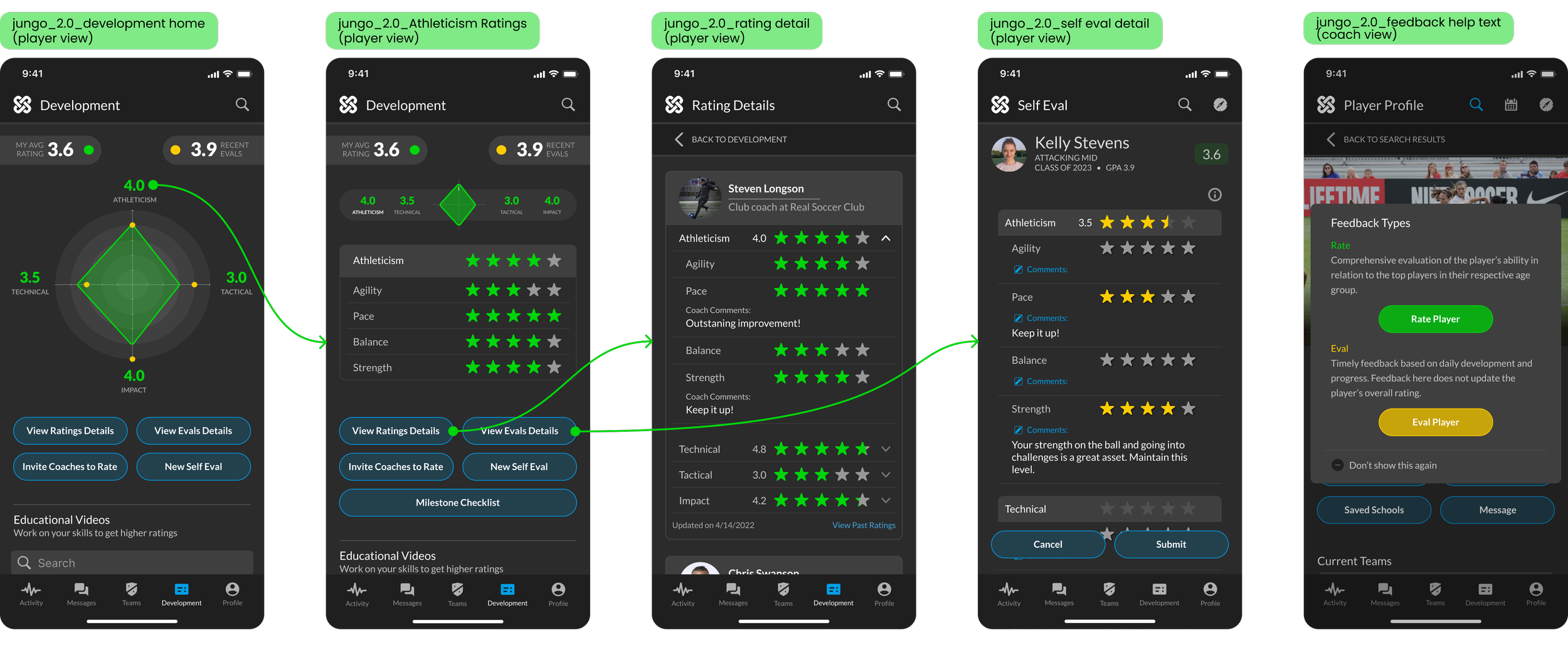
After
I established a distinct Feedback and Development page in the main navigation as a hub for players of all skill levels. I designed rec-focused features, such as skill videos tied to the rating pillars, to engage the players in continuous education and improvement. I re-assigned accent colors to clarify the difference between ratings— green for long term growth, and evals— yellow for temporary, short term feedback) and included a help screen with detailed definitions. The player’s current rating is presented as an interactive radial graph, gamifying their core feedback experience. The lists of individual ratings and evals are folded into a 2nd level navigation, keeping the information hierarchy clear.
Interactive Prototype
Explore the Rec Player’s functionality in the Development prototype by tapping the interactive chart and buttons
New: Team Pages
In the MVP product, coaches were oriented to support individual players on their recruitment journeys and lacked any tools to communicate with or organize the logistics of their full team. A key adoption path in the rec soccer market is team organization and communication. The addition of this feature meant Jungo could replace other generic team logistics apps with a soccer specific experience.
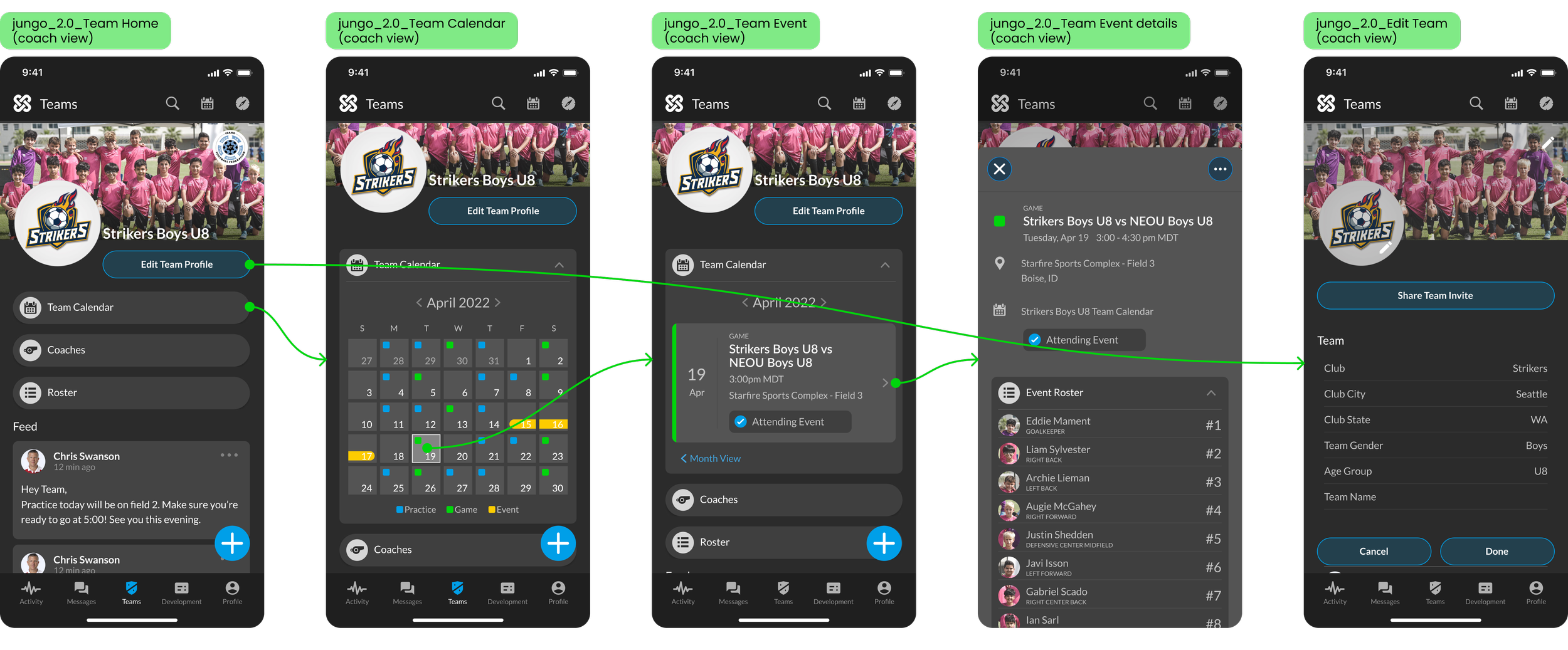
Solution
The Team Page functions as a role-aware hub and adoption magnet for the rec soccer market. Coaches can manage rosters, post announcements, schedule events, and collect post-match reports from a single screen. Parents see a simplified view of each of their children's teams. College recruiters can follow teams and get notified about public events — a passive discovery tool that requires no direct outreach.
New: Achievement Badges
Players disengage when they can’t see their improvement, and Jungo is in the business of keeping kids in their sport. In rec soccer, players’ hard skills develop more slowly than what the 5-star recruit rating system can accurately visualize. Kids also naturally develop at different speeds, leading to some players feeling left behind in comparative ratings systems. Their contributions to the team at this level often fall outside of traditional hard skills. Emphasizing these soccer soft skills engages more than just the elite players and creates an environment for the whole team to develop important life skills.
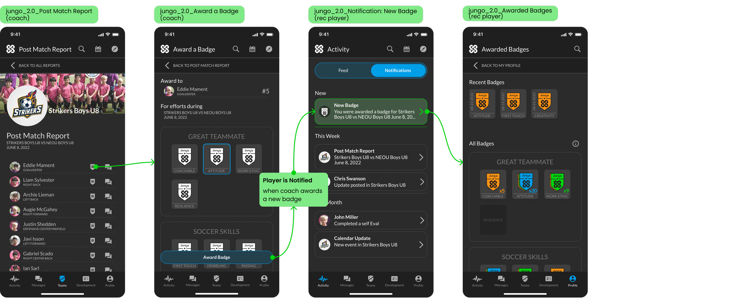
Solution
The achievement badge system was designed to make recognition accessible to players at every level, not just standouts. Through a player typology framework, I defined distinct achievement categories that reward different expressions of growth — consistency, improvement rate, teamwork, and skill milestones — ensuring that a rec player and a competitive recruit both have meaningful goals to work toward within the same platform. Badge categories and the flow to award a badge were tested and refined with a panel of youth coaches. The coach’s badge mechanism is tied directly into the post match report from each player, allowing them to award their players with a sensitivity toward how they felt about their performance.
Design System
I built and delivered a product style guide and fully specified component library that served as the single source of truth for the development team throughout the 2.0 build. It ensured an accessible mobile app with WCAG AA compliant contrast ratios, interactive target sizes, and consistent navigation and identification.


Impact + Results
-
Broader Reach
With the launch of youth-focused features, Jungo gained 10,000 users in the first six months — proving significant traction for their seed investment round and broadening their user base beyond the elite players. -
Higher Recruitment Rates
Via in-app tracking metrics, competitive players using Jungo indicated a 30% higher placement rate following the app redesign — validating that a better product experience translates directly to better outcomes for the platform's most high-stakes users. -
Expanding to basketball
The redesigned Jungo platform attracted investors interested in expanding to basketball — a sport with 20 million youth players. The architecture and design system built for Jungo 2.0 proved flexible enough to support that growth.
credits_ completed at Paper Crane Factory in collaboration with Jungo founding team + AppEvolve (app dev)